CASE STUDY .02 | 323.3264 STR
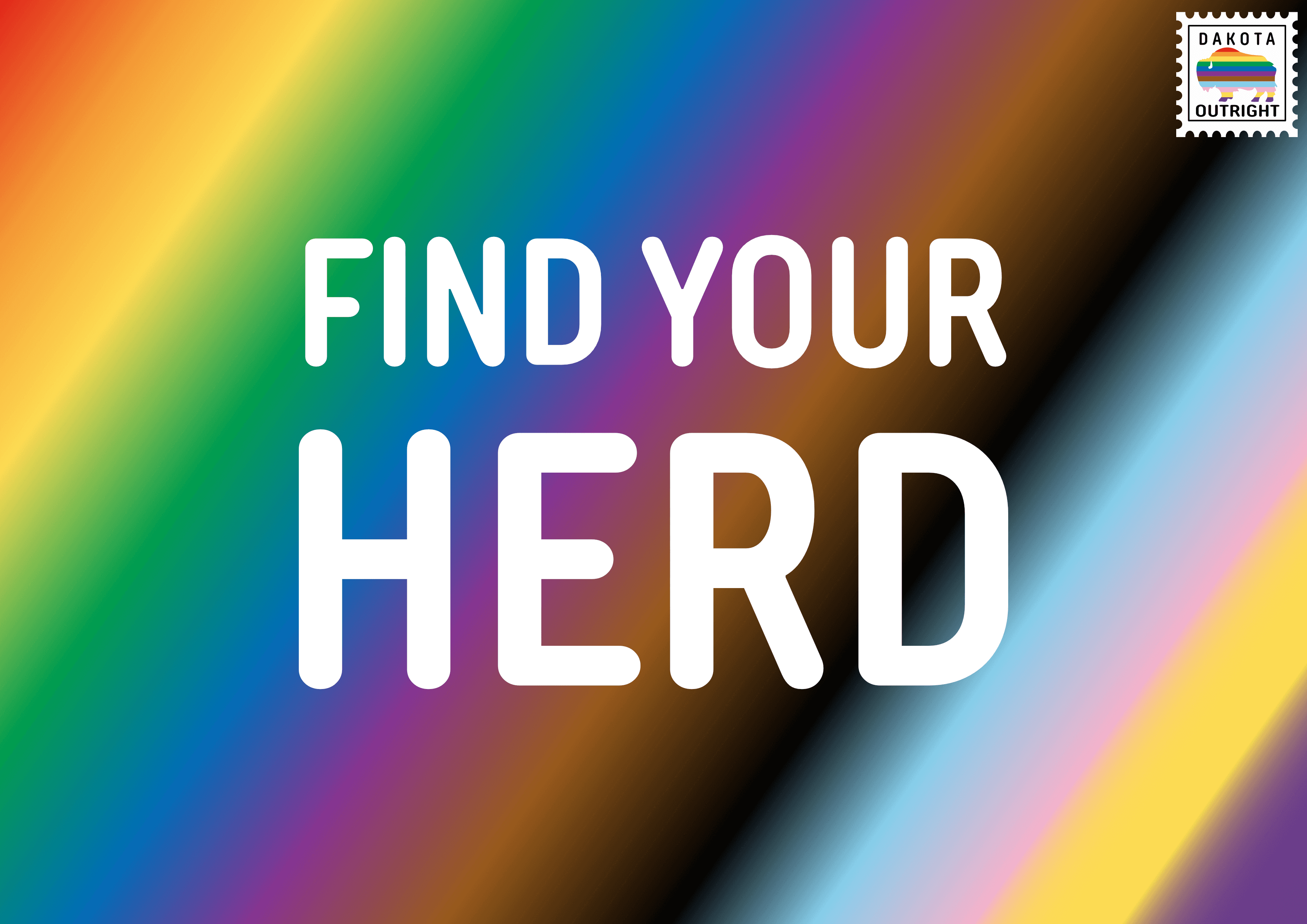
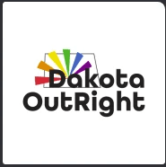
Dakota OutRight
Pride on the Plains: A Strategic Rebrand
A four-part visual exploration where domestic interiors become surreal thresholds. Each piece transforms familiar spaces into portals of queer imagination—where nature intrudes, memory blooms, and identity reshapes the room.
The Challenge
Dakota OutRight had been a lifeline for LGBTQ+ folks across North Dakota for over 20 years, but their brand didn't reflect the vibrancy of their work. The visual identity lacked clarity, scalability, and the bold pride energy their community deserved.
The Solution
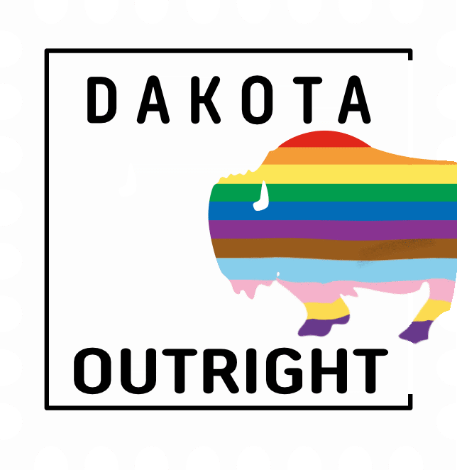
Through community interviews at Qsummit, visual testing, and strategic iteration, we created a brand system that's bold, accessible, and unmistakably queer. The Buffalo Pride logo emerged as the strongest symbol—combining North Dakota's iconic bison with pride colors.
"How might we help rural LGBTQ2S+ youth feel seen, supported, and
connected through Dakota OutRight's digital presence?"?
001 / DEFINE
Define
002 / DISCOVER
Understand the needs of rural LGBTQ+ communities through interviews, organizational audits, and community feedback.
003 / DESIGN
004 / DEPLOY
Discover
Design
Deploy
Explore visual metaphors from North Dakota's landscape, queer symbolism, and prairie identity through moodboards and sketches.
Translate insights into a flexible brand system with logo variations, color palette, typography, and application guidelines.
Test, refine, and launch across digital platforms, print materials, merchandise, and event signage statewide.
DESIGN PROCESS
Skylar
They/Them • 19 • Minot, ND
Identity: Queer, nonbinary, rural youth
Tech: Mobile, Instagram, TikTok, Twitter
Goals: Find local LGBTQ+ Events, Friends, etc.
"I want to be proud of who I am—but I also need to feel safe. Dakota OutRight helps me feel less alone."
Design Implication: Skylar's experience shaped the mobile-first layout, warm tone, and clear calls to action throughout the rebrand. Every design decision prioritized accessibility and visibility.
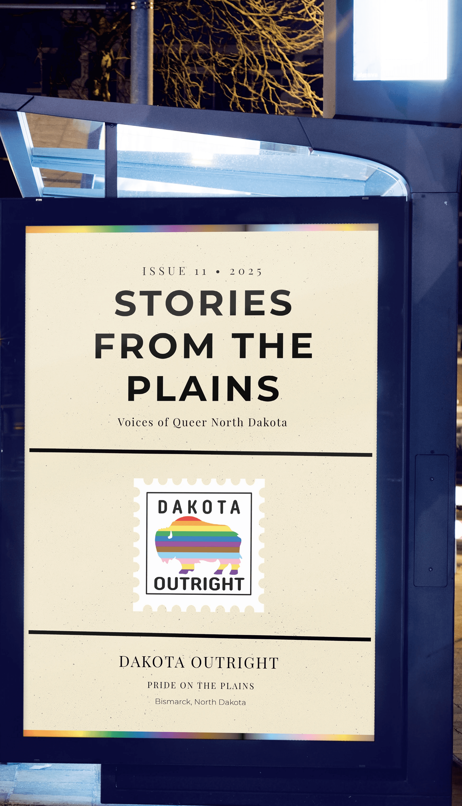
PRINT CAMPAGIN

UNDERSTANDING OUR COMMUNITY
VISUAL ARCHIVE
LOGO EVOLUTION
State Capital
Rainbow Colors from Capital Location

Inverted Final Logo
Bison with Pride stripes - Strength
meets visibility
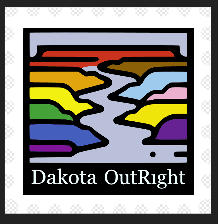
Missouri River Runs
Banks of the Missouri in the
color of the Progressive Flag
PRIDE PALETTE
Red
#E40303
Orange
#FF8C00
Yellow
#FFED00
Green
#008026
Blue
#24408E
Violet
#732982
Brown
#8B6000
Black
#000000
Light Blue
#9ECAED
Light Pink
#E9AED0
Dark Yellow
#F0E60A
Purple
#652792
200+
Community Participants
3
Testing Results
Annual Pride Events
20+
Years of Advocacy
IMPACT & RESULTS