CASE STUDY .01 | 741.6 JGS
North Star Radio
Tuning Identity to Frequency
Building a civic identity with queer resonance. A multi-platform brand system that amplifies queer, veteran, and rural voices across North Dakota—translating personal resonance into visual identity through celestial design and grounded messaging.
The Challenge
North Star Radio needed to communicate queer identity, rural resilience, and veteran storytelling—all within a visual system that felt trustworthy, accessible, and emotionally resonant. The challenge was balancing coded symbolism (lavender, wheatgrass, celestial motifs) with public-facing clarity.
The Solution
Through community interviews, visual testing, and competitor analysis, we discovered that clarity and trust were just as vital as symbolism. The Starburst logo emerged as the strongest direction: bold, scalable, and familiar. It evokes transmission, guidance, and visibility.

"How might we design a brand that feels civic and trustworthy—while quietly signaling
queer identity, rural resilience, and veteran pride?
001 / DEFINE
Define
002 / DISCOVER
Understand the emotional and cultural needs of North Star Radio's audience through interviews and research.
003 / DESIGN
004 / DEPLOY
Discover
Design
Deploy
Explore visual metaphors and cultural references—celestial maps, radio towers, prairie landscapes, and queer symbolism.
Translate insights into visual identity—logo system, color palette, typography, and interactive UI components.
Test, refine, and implement across digital platforms, merchandise, and community touchpoints.
DESIGN PROCESS
Sarah Mitchell
She/Her • 34 • Fargo, ND
Role: Marketing Manager
Listening: Morning commute, weekends
Tech Savvy: Moderate

"I love the station, but I'm constantly missing episodes of my favorite shows. I need an easy way to keep track and listen when it works for my schedule."
Design Implication: Sarah's experience shaped our focus on clarity, accessibility, and seamless cross-device functionality. Every interface decision prioritized intuitive navigation and personalized content discovery.
UNDERSTANDING OUR AUDIENCE
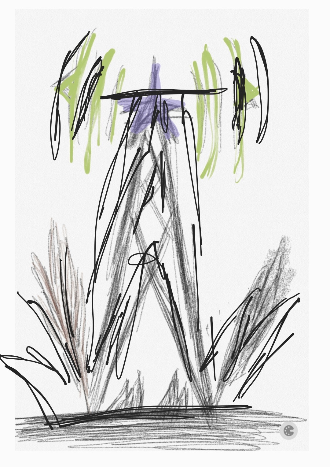
EARLY EXPLORATIONS
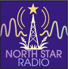
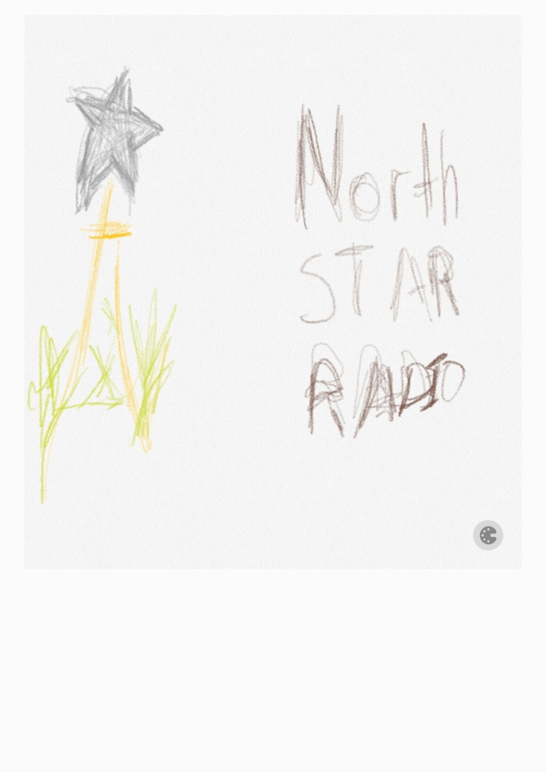
Tower + Wheatgrass
Radio Tower w/ Prairie elements

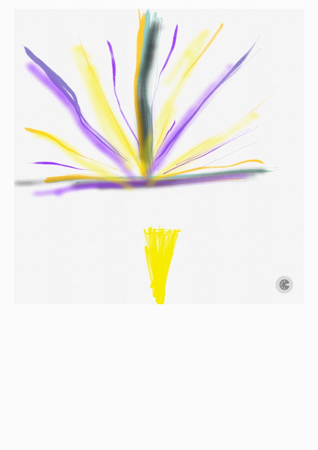
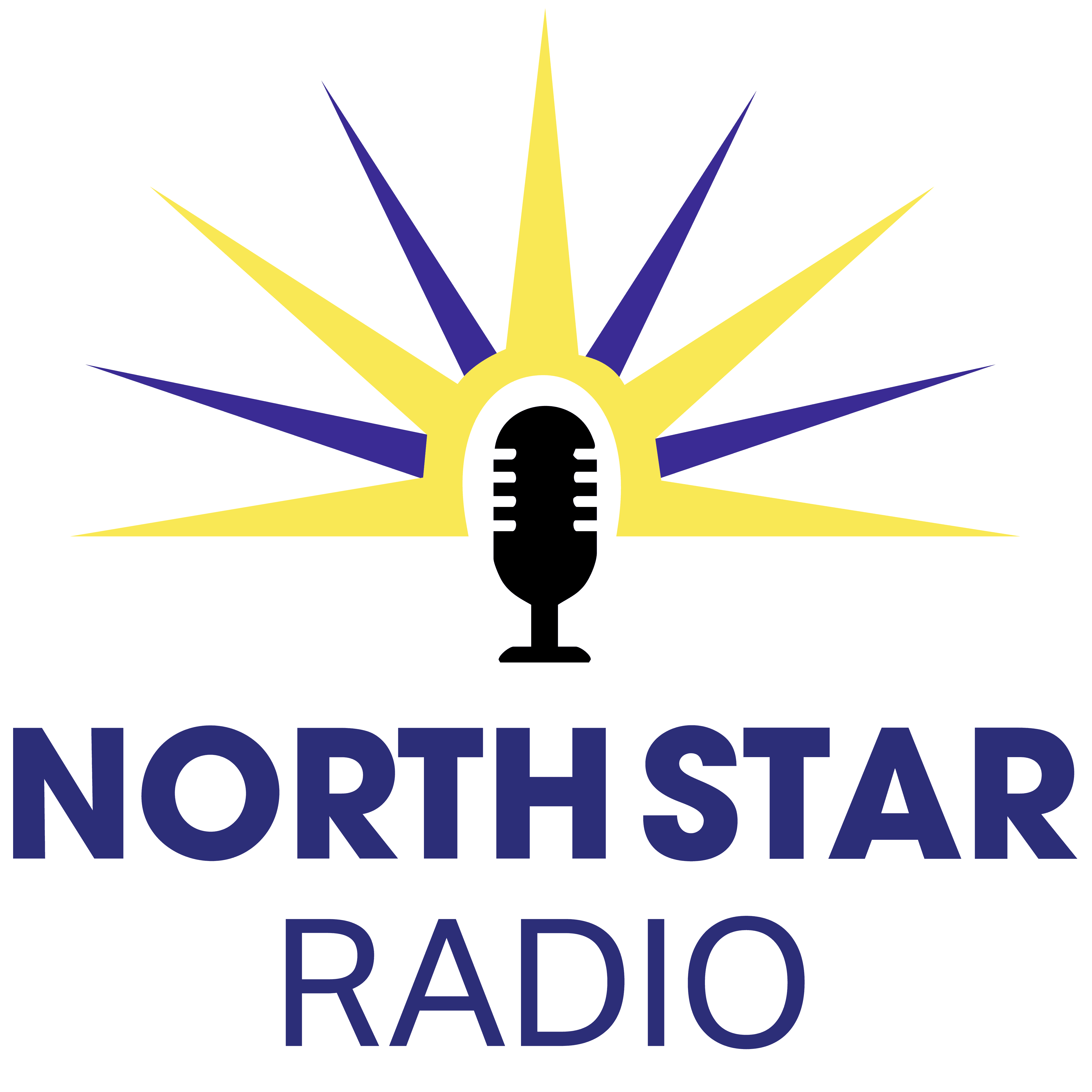
Starbust (Winner)
Bold North Star w/ transmission rays
Tower + Font Right Side
Never Made it out of Design Phase.
LOGO TESTING RESULTS
Tower + Wheatgrass
Radio Tower w/ Prairie elements
21 votes ( 27% )
Starbust (Winner)
Bold North Star w/ transmission rays
42 votes ( 52% )
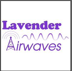
Lavender Airwaves
Abstract radio waves in queer colors
15 votes ( 19% )


2nd Design Component
Indigo
RGB: 30, 18, 66
HEX: #1E1242
Trust, Clarity, nighttime broadcasts
Lavender
RGB: 161, 177, 255
HEX: #A1B1FF
Queer-coded pride, softness
Wheat Gold
RGB: 235, 224, 124
HEX: #EBE07C
Midwest warmth, prairie identity
COLOR PALETTE